FindUTM
Designing and creating a navigation app for UofT's campus

Navigating a large, complex sprawl of land is often difficult for those unacquainted with the premises. This is particularly true on the campus of UTM, where first-year students and—due to the COVID-19 pandemic—latter year students alike have not yet gained a familiarity to the layout of the university.
The goal of our observations was to understand how UTM students navigate the campus. We randomly observed twenty students in various locations, noting behaviors and interactions to identify potential navigational challenges. Notably, we also observed students without apparent issues to understand self-created solutions. Most observations involved individuals navigating alone, with some group instances categorized as single users due to similar behavior.
Insights revealed that the main challenge was navigating campus to find locations or people. Many students relied on their phones, while others used a trial-and-error approach, which induced discomfort and displayed signs of hesitancy and a lack of confidence.
Through our qualitative analysis of the observations conducted, three key themes have been identified:
Uncertainty about one's location
The use of a mobile device to address navigation issues
Seeking help from others to find a desired location
These themes aligned with the most common solutions employed by individuals:
1.
Trial and Error
2.
Asking for Assistance
3.
Using a Mobile Device
These features listed below are focused on creating a user-friendly and effective navigation application based on the findings.
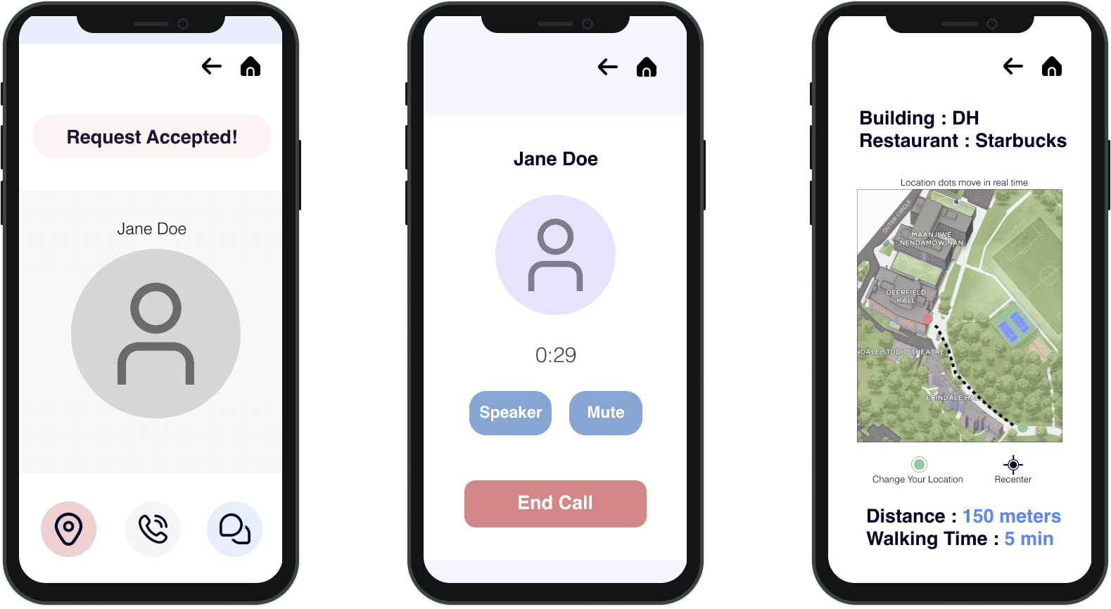
Our team had three versions of low and mid fidelity wireframes and three sessions of user testing.
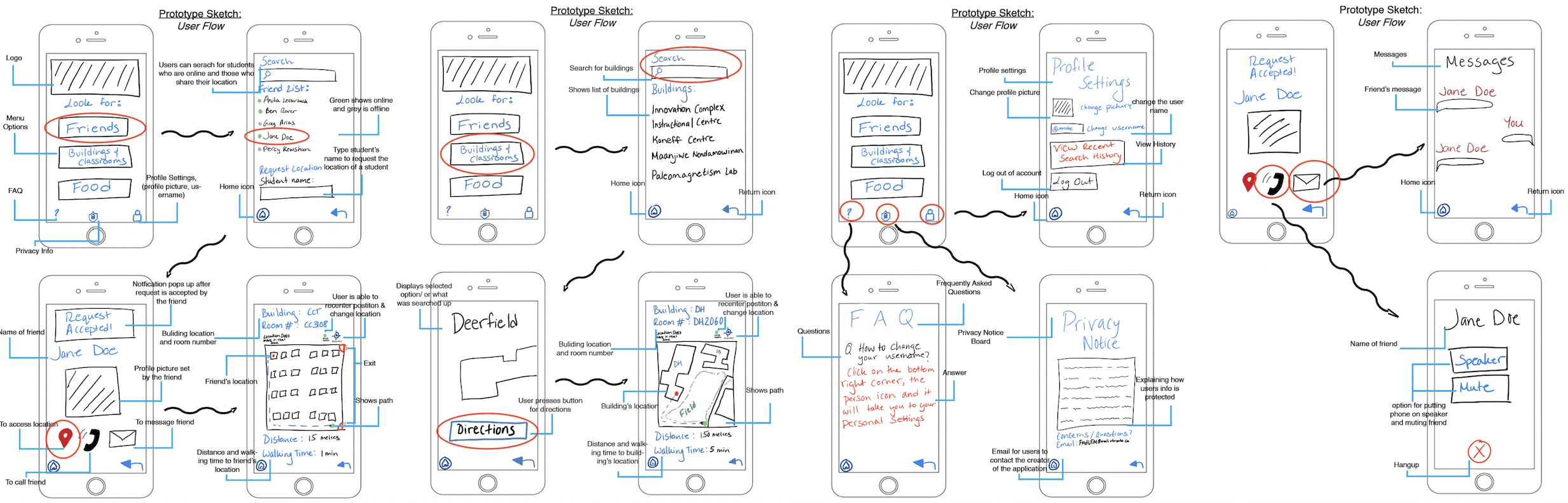
This is a diagram that represents the possible options users can take and the flow for each option.


© Jasmine 2026